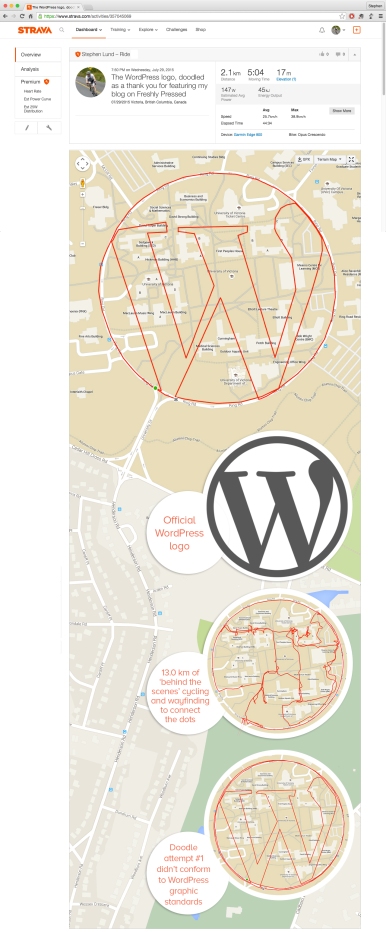
Doodled as a huge thank you to WordPress for featuring a recent post on “Freshly Pressed”

The University of Victoria campus and its amazingly circular Ring Road provided the canvas for my GPS doodle of the WordPress logo – a show of gratitude for featuring one of my posts on Freshly Pressed
The exciting news came across my Twitter feed as I was winding down after my Saturday morning bike ride.
My July 9 post – “Six months. Two wheels. 50 GPS doodles.” – had been Freshly Pressed.
As WordPress explains, “Every day, we feature a few editors’ picks on the Freshly Pressed section of WordPress.com. Freshly Pressed posts can be about anything — and published today or years ago — but they all have a few things in common: they enlighten us, inspire us, entertain us, and get us talking.”
As a show of gratitude, I decided to doodle the WordPress logo.
The WordPress logo is a stylized W enclosed in a perfect circle. And as the only perfect circle on the Victoria map is University of Victoria’s 1.9-kilometre Ring Road, I knew right away what my canvas would be.
At a mere 0.3 km2, this was far and away my smallest canvas to date. (For most of my GPS doodles, my canvas is at least 10 km2 and as large as 60 km2 (for my Siren of the Salish Sea).
As I learned early on, a large canvas is far more ‘forgiving’ than a small one. If you stray slightly off course, overshoot a turn or miscalculate a maneuver, you may not even notice it in the finished picture. But on a small scale, precision is everything.
For my doodle of the WordPress logo, I had to rely almost entirely on my ‘connecting the dots’ technique. (Stopping my Garmin at point A and restarting it at point B creates a straight line that connects the dots.) I overlaid the WordPress logo on a satellite view of the UVic campus and plotted key points along the outline of the W; and as I pedalled around campus, I used my iPhone map app to zero in on the points I had plotted.
My first attempt at the WordPress logo (inset image #3) highlights the importance of precision on a small canvas. Adjusting some of the STOP/START points by just a few metres for version 2 made a monumental difference.
Total distance cycled to create my GPS doodle of the WordPress logo (including my failed version 1) was 29.8 km (18.5 mi).
See it on Strava
Note: The GPS points will render correctly only if you are logged in at Strava.com

Really impressive and smooth, awesome job!
LikeLiked by 1 person
Thanks, Shane. v1 was a bit disappointing, but on such a small canvas it was quite easy to iron out the wrinkles.
LikeLiked by 1 person
Very smooth. Well done on your freshly pressed too! 😀
LikeLiked by 1 person
Thanks, Kx Jx. Being Freshly Pressed was a wholly unexpected but very pleasant surprise!
LikeLike
Nice lines and very creative
LikeLiked by 1 person
Appreciate the kind words. Thank you!
LikeLike
Pingback: Tour de Victoria logo • Ryder Hesjedal on his Cannondale | Sketchbook of a GPS Artist